VULNERABILITY MAP

Mapping toxic flooding vulnerability for petrochemical sites and communities

Our team analyzed more than 100 indicators of petrochemical facility, environmental, health, social and economic hazards and burdens to understand and map toxic flooding vulnerabilities in the Galveston Bay region.

The result is a scoring system and map that rank and display the overall vulnerability from the combination of indicators along with insights into the key indicators driving that vulnerability. Two sets of vulnerability scores were developed: one for ranking individual petrochemical facility sites, and one for identifying vulnerable areas of communities throughout the study area.

These resources are for planners, engineers, policy makers and concerned members of the Gulf Coast to understand the vulnerabilities to toxic flooding present at the facility and community level and assist with prioritizing locations for nature based solutions that mitigate risk.

Our approach advances flood vulnerability research with novel indicators that combine flood and chemical hazards and that sum individual facility vulnerabilities for their combined impact on a given community. We do this using a coupled modeling system that physically constrains the connection between facility sources and impacted communities.

Facilities that were highly vulnerable for chemical releases are defined as located in areas prone to severe flooding, have landscape characteristics that promote runoff and soil erosion, process chemicals with high mobility in water and eroded soil, handle chemicals with the potential for hazardous accidents and health harms, and have lacked compliance with safety regulations in the past.

The top overall scoring facilities, shown at right, tended to have high scores across the three main categories: flood, chemical transport, and facility hazards.  These should be prioritized for green infrastructure, as the impact of mitigating flood risks would be the greatest.

A few high scoring facilities had no documented hazards based on available data sources. Those sites are good candidates for further investigation, to verify that if flooding occurs, hazardous chemicals will not be present to be released. 

We defined petrochemical sites as those associated with downstream oil and gas industry. This included refineries, petroleum terminals, warehousing and storage and chemical manufacturing of paint, pesticides, and plastics, to name a few of the many products. We identified these facilities using their North American Industry Classification System (NAICS) codes (324, 325, 326, 424710 and 493190).

Communities highly vulnerable to toxic flooding are in the path of potential chemical releases from multiple facilities and face a high combined exposure if their area were to experience an extreme event. These communities are located along coasts, Bayous, rivers and other inland waterways which variously flood depending on the storm. For example, Hurricane Harvey generated dangerous flooding from rivers and rainfall in communities near inland waterways, while other storms like Hurricane Ike caused more storm surge flooding in coastal communities.

These communities also lack natural infrastructure and green spaces that could boost their resilience and are often starting from a lower baseline socioeconomic condition. Baseline health and socioeconomic indicators contribute half of the overall vulnerability score and their influence is evident in map where features like the affluent area know as the Houston Arrow can be seen. Ecosystem service indicators reflect established patterns of urbanization.

Galena Park and Texas City are two examples of highly vulnerable neighborhoods in the study area for their dense petrochemical industry. Using these communities as case studies, we modeled how nature-based solutions can help communities be more resilient against future flood events.

How can we use nature to build more resilient communities in the Gulf?

We developed a master plan for both Galena Park and Texas City as examples of how nature based solutions could mitigate flooding.

At the facility level, the measures of vulnerability correspond to three main domains:

  • Flooding vulnerability – Indicators in this domain relate to how severe flooding might be, including comparison with floodplains from FEMA or Harvey, and results based on computer modeling.
  • Chemical transport – Indicators in this domain relate to the potential for chemicals from the facility to be transported off-site due to flooding, and are based on results from computer modeling.
  • Facility hazards – Indicators in this domain relate to the inherent vulnerability of the facility due to potential for hazardous accidents, the types of chemicals typically present or released, and the degree to which the facility has complied with safety regulations in the past.

At the community level, the measures of vulnerability correspond to four main domains:

  • Ecosystem – Indicators in this domain relate to how the land is used (e.g., parks and greenspace vs. pavement) and the types of ecological services it can provide.
  • Flooding and chemical transport – Indicators in this domain relate to how severe flooding might be, the potential for chemicals in general to move into the area, and the extent to which chemicals from facilities specifically may move into the area.
  • Baseline health – Indicators in this domain relate to the existing conditions related to diseases, access to health care, and life expectancy, and with worse outcomes indicating poorer resilience.
  • Social and economic – Indicators in this domain relate to the existing conditions related to quality of housing and transportation, vulnerable populations, and economic circumstances, with worse outcomes indicating poorer resilience.

The map allows you to:

  • Explore the relative vulnerability of different communities across the study area.
  • View rankings of the underlying indicators to understand the biggest drivers of vulnerability and inform solution strategies.
  • Identify specific petrochemical facilities that have the potential to release harmful chemicals in the event of a flood.

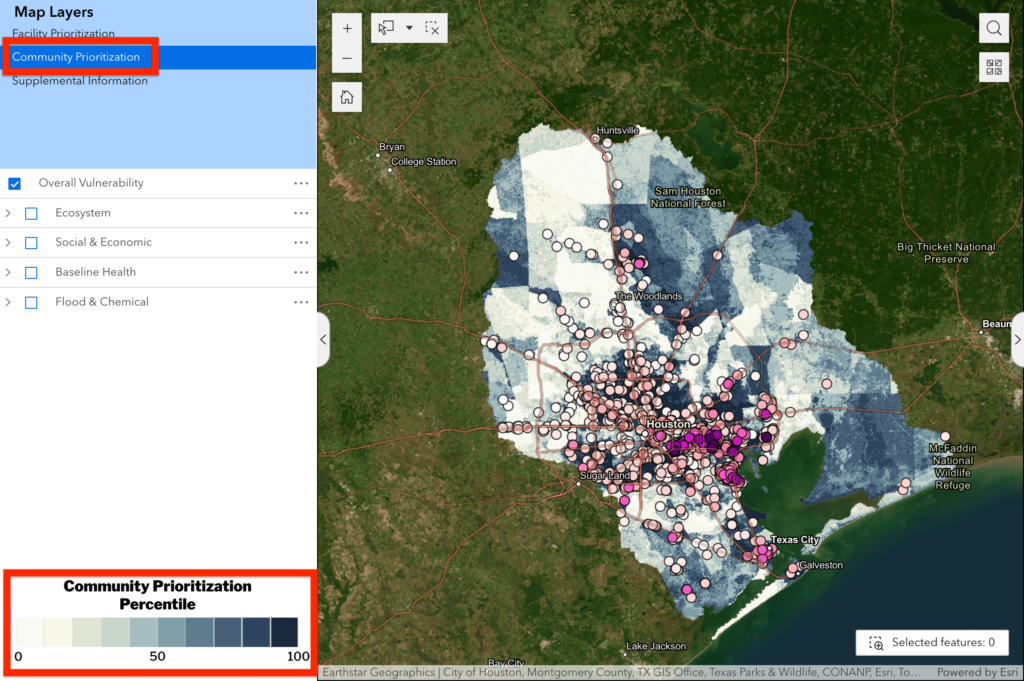
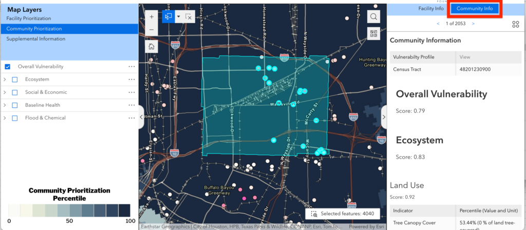
Users might begin by exploring the overall community score that takes into account and synthesizes all of the many hazard and resilience factors that we analyzed, in the area where they live or work on projects, to identify hot spots of vulnerability. The darker the blue, the more vulnerable the community is.

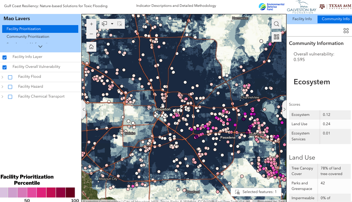
From there, users can dig into specific interest areas, and zoom and click locations to view rankings in all of the underlying indicators to understand their biggest drivers of vulnerability and inform solution strategies. All scores and indicator data are shown in the sliding panel on the right hand side of the map, highlighted in the example below. 

The scores for each domain, subdomain, and individual indicator can be viewed on the map by selecting a layer from the catalog/tree on the left. In the example below, the Ecosystem Vulnerability score is displayed. This score shows the combined result for all of the Ecosystem indicators.

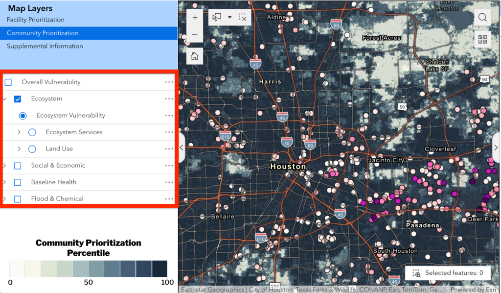
Exploring the various map layers can reveal key drivers of vulnerability which will vary by location.  As another example, exploring the indicators in the Flood & Chemical category, a user may find that storm surge is a high concern for a coastal low-lying communities while soil erosion driven by stormwater may be a top concern for communities along waterways farther from the sea coast.

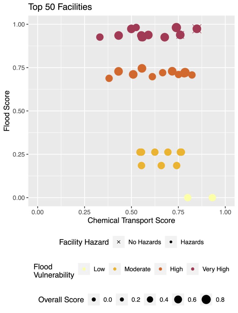
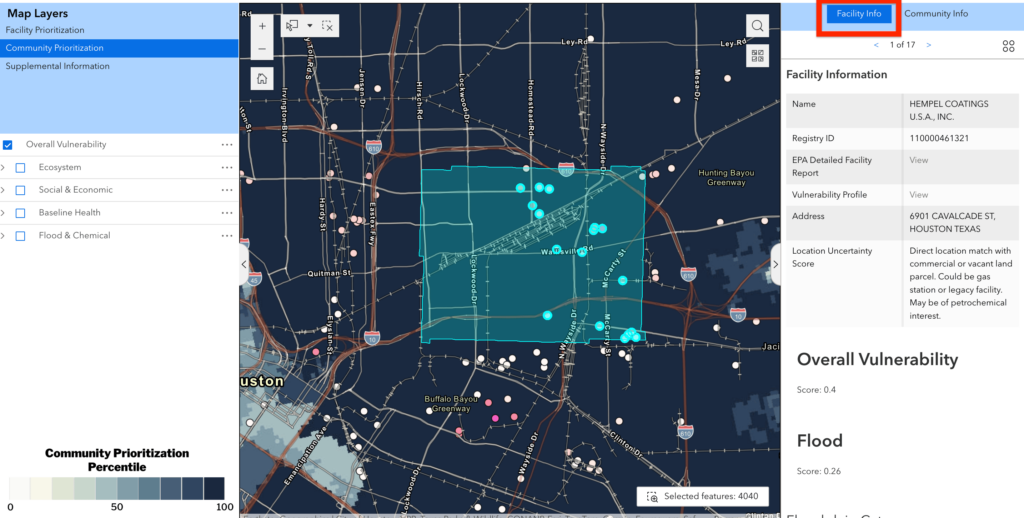
Next, users can explore the facility-based prioritization to identify specific petrochemical facilities that have the potential to release harmful chemicals in the event of a flood. The overall scores provide a synthesized understanding of priority vulnerable facilities and the indicator scores reveal the underlying drivers to guide more targeted decision-making. Change between Community and Facility views using the Map Layers selection at the top left of the map.

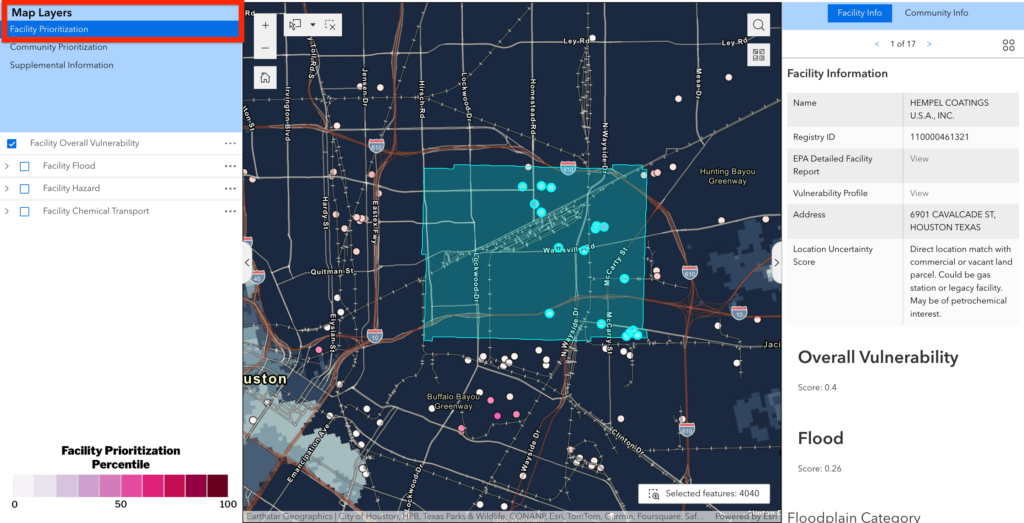
The combined community and facility assessments inform the selection and design of nature-based solutions. For example, the conditions may be such that a single facility dominates the risk to a community and flood-prevention or chemical retention should be focused at that site. Alternatively, the community may be vulnerable to chemical releases from many different sources and a more holistic watershed-level strategy is needed to increase resilience.

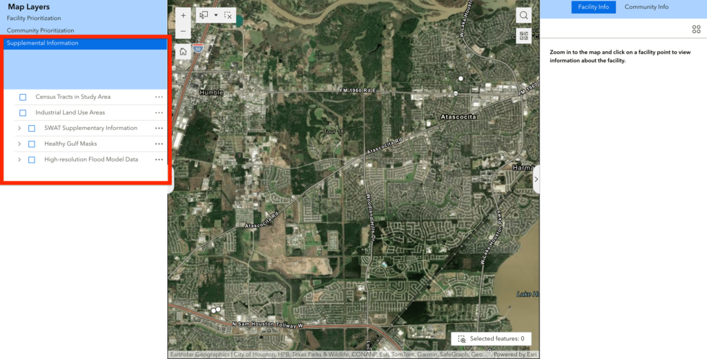
Additional layers are provided under Supplemental Information to support users of the Create NBS Guide.


Use the select tool to draw a box over the map to capture multiple communities and facilities of interest, as shown below.

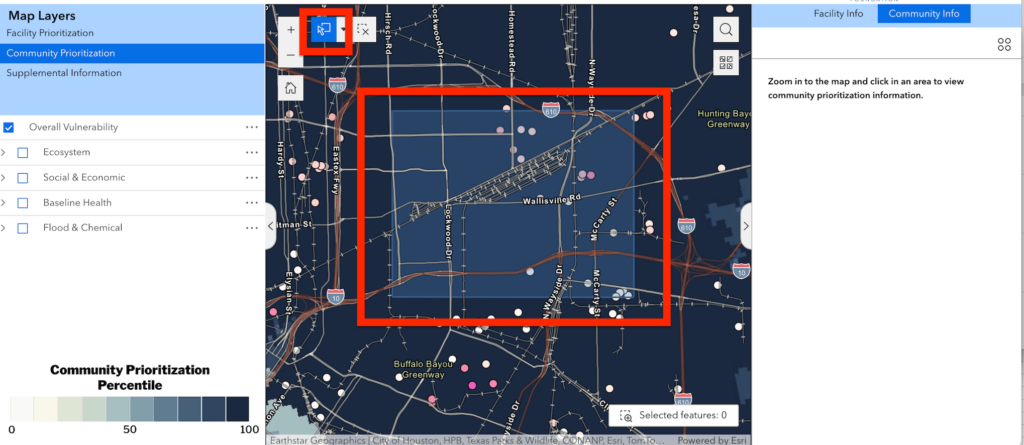
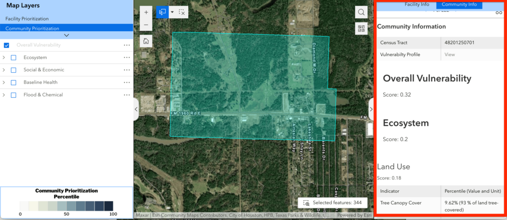
The information will populate in the right hand window for facilities and communities captured in the selection. The screenshot below shows there are 2053 community grid cells captured by the selection, each with their own unique set of indicator scores.

In this selection, there are 17 facilities with their own unique set of indicator scores.

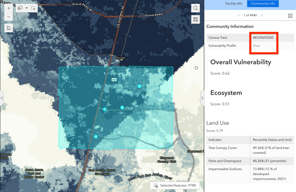
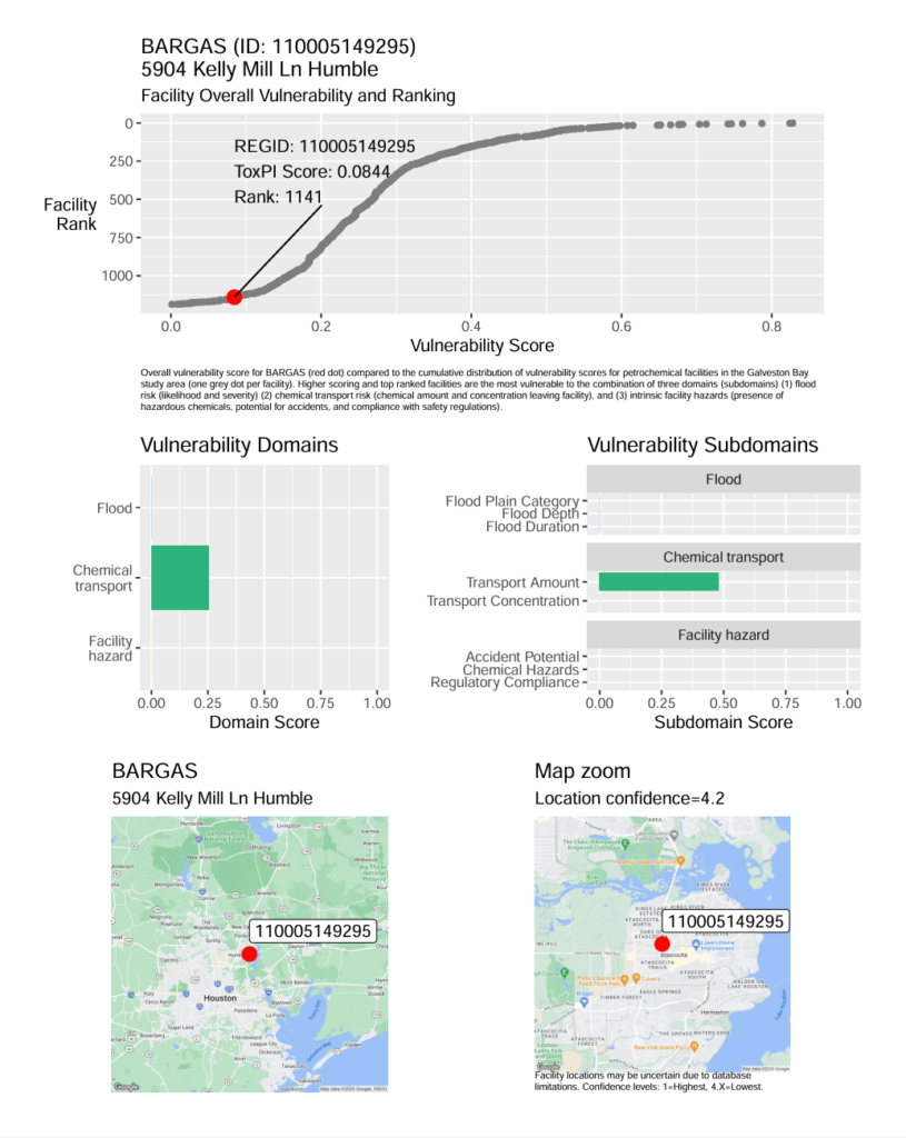
There are also PDF vulnerability profiles available for download for each census tract and facility. The census tract profiles can be accessed via the Community Info tab once you’ve made a selection on the map.

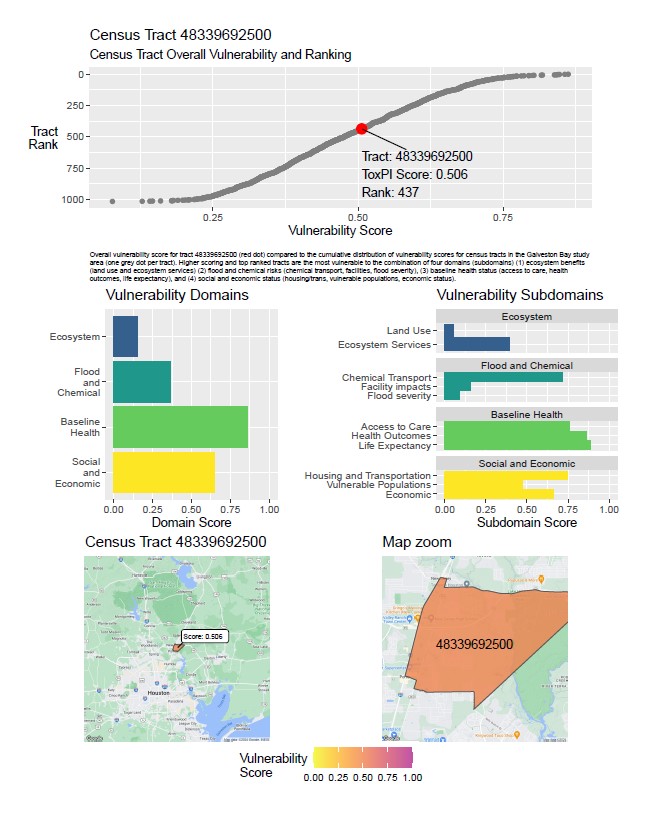
A census tract vulnerability profile looks like this:

Similarly, each unique facility report can be accessed in the Facility Info tab for a selected facility. 

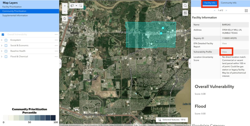
A facility vulnerability profile looks like this:

Limitations:

  • Location information for some facilities was uncertain. We attempted to geolocate facilities with the best available data and provided a location uncertainty score for each site.
  • Not all facilities participate in all regulatory programs (e.g. ECHO, NPDES, RMP) from which we sourced Facility Hazard indicators. We assumed 0 values (no vulnerability) for facilities without data for a particular program. However, it may be the case that vulnerability still exists. 
  • Flood modeling was not possible at every location in the study area, so model-based indicators are given a median value to have a neutral effect on vulnerability scores where we did not model. View where we modeled in the map under Supplemental Information. 
Scroll to Top